


 by
by CREATE, SHOW, TEST:
Optimizing freenet’s digital assets with the “digital experience Sandbox”
This whitepaper presents key findings from a user experience research initiative conducted by freenet AG in collaboration with eye square GmbH. The study explored how varying levels of tariff information impact user behavior and the decision for a particular product. By leveraging eye square’s Sandbox environment, the research evaluated three homepage designs, yielding actionable insights to enhance digital communication and drive more effective customer journeys.
1. Background and Research Objective
The core objective of the study was to evaluate user behavior and performance across three versions of the klarmobil.de homepage. The research specifically sought to determine whether increasing the amount of information presented on tariff overview tiles would improve user experience and decision-making.
Three prototype versions were tested:
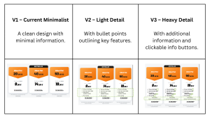
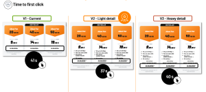
Fig 1: tested stimuli
The following three hypotheses were to be validated with this research:
- Easier comparison: “If we increase the amount of information on the homepage, we improve the UX because tariffs can be compared more easily.”
- Quicker decision-making:““If we increase the amount of information on the homepage, the time needed to choose a tariff decreases because all the necessary information is easy to find.”
- Faster task completion: “If we increase the amount of information on the homepage, the average task completion time decreases because it is easier for users to make fast and safe tariff decisions.”
2. Methodological Approach SANDBOXING
A Sandbox is a sequestered, data-safe digital environment that enables rapid creation and user testing. It runs in three stages: Extract, Create & Show, Test.
Sandboxing accelerates the digital experience creation process by integrating component extraction, visual editing, and user testing into one cohesive workflow. It provides a controlled and realistic environment where UX professionals can easily build interactive mockups based on live websites or Figma prototypes, share them instantly, and gather meaningful behavioral data from real users.
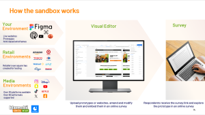
Fig. 2: Sandbox features
The eye square Sandbox technology assesses all relevant psychological systems; in addition, it tracks relevant business metrics such as purchase decisions and other behavioral data on, i.e., prototypes in a controlled live environment— which is a rare and cutting-edge feature.
Ultimately, the Sandbox helps clients find optimal responses to classic project constraints such as scope, cost, and time. UX professionals can deliver the highest quality results by creating and testing designs without requesting limited design or IT resources in the organization. This keeps costs and time low without reducing the scope.
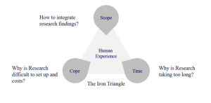
Fig 3: classic project constraints „the iron triangle”
The usage of Sandbox allowed freenet and eye square to:
- Create and test three prototypes without using any design or IT resources at freenet.
- Perform click tracking and other behavioral data analysis during user interaction.
Study facts
Participants: n=305 decision makers in mobile plan purchases across Germany
Device: desktop
Test Design: monadic approach with ~ n=100 participants per version
Task: navigate through the prototype journey (homepage → product page → cart) and choose their desired tariff.
Collected data:
- Behavioral metrics: click data such as time to first click and click share, total task time, and dwell time per page.
- Explicit feedback: UX ratings, statement agreement, version preference.
3. Key Findings and Insights
Evaluation: Versions 02 and 03 perform best as they provide more tariff information
Survey data revealed that version 02 delivered clear and reliable tariff information that supported informed decisions. Users state that the tariff details could be easily understood, and the tariffs were displayed in an attractive and trustworthy manner.
The more information provided, the more secure consumers felt about their decision. When comparing all three designs, version 03 excelled, surpassing the rest as the most information rich. Yet, behavioral data revealed that additional information elements were only clicked on by 5% of participants; therefore, they do not actually contribute toward making an informed decision.
Version 1 (minimalist) makes it harder for users to feel secure in their decisions and showed the weakest ratings across all items.
Behavior: Version 02 wins with the most straightforward and quick user flow
Time to first click: with v2 (light detail), the call to action (“to the offer”) was the most rapidly clicked. The lightly detailed design supported quick decision-making: after having scanned the informational bullet points, users could only click one button (the CTA) and move forward.
Task time: Version 2 also allows the fastest task completion with the most efficient, linear flow. The time spent on the homepage is much lower than with version 01 (minimal; users search for more information) and version 03 (heavy detail; users need to read more information).
4. Conclusions and Strategic Recommendations
Winner: Version 2 – Light Detail
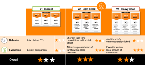
Fig 5: Overview final scores
- Offers optimal balance of information and usability.
- Enables quicker and more confident decisions.
UX Hypothesis Validation
The two hypotheses, “quicker decision making” and “faster task completion”, could be validated with this research. Meanwhile, the hypothesis “easier comparison” could not be validated and requires further research.
Strategic Takeaways for freenet
- The Digital Experience Sandbox is a powerful tool for testing design concepts without IT overhead.
- High-fidelity prototypes can be repurposed for future tests, including qualitative research.
- Combining explicit survey data with implicit behavioral insights yields richer, more actionable outcomes.
Next Steps
- Implement Version 2 as part of a live A/B test.
- Continue iterative testing to refine and validate UX assumptions.
Contact
Inga Scharfenberg, freenet AG, Manager Market Research & Customer Advocacy, Inga.Scharfenberg@freenet.ag
Carina Lehne de López, eye square GmbH, Chief Experience Officer & Partner, delopez@eye-square.com
Powering the Future of UX Research: Driving Innovation and Advancements
Join the UX360 community to connect with industry leaders, access cutting-edge insights, and stay at the forefront of UX research innovation. Elevate your impact, accelerate your projects, and shape the future of user experience.